Uncharted Territory

August 5, 2018

UK Heatwaves: What are the Global Warming Risks? (1) A Really Freak Summer

I suggested last time that 2018 could beat 1976 to the title of UK’s hottest summer ever in the whole Central England Temperature (CET) series which goes back to 1659. I now doubt that will happen since a change in the weather is on its way. Here are Weathercast’s projections, albeit a couple of days out of date as their site isn’t updating at the moment (I guess someone will be in the office on Monday morning!):

180805 Change in the weather Weathercast

And here’s what the Met Office have to say:

180805 Change in the weather Met Office

The CET mean for August so far is impressive:
180805 CET to 4th August 2018but a period of average daily mean temperatures (around 16C) will soon drag the monthly mean down below the 18C necessary for the June through August average to be higher than in 1976. Note that, after a cool start, it is now very possible that 2018 as a whole will be hotter than the previous hottest year in the entire CET record, 2014.

2018 has been exceptional, though. The problem is the arbitrary period (June, July and August) defined as the meteorological summer. But for 2018 to break all-time records it’s not even necessary to split months (e.g. by taking a period ending on 7th August). As I pointed out a fortnight ago, 2018 has been easily the hottest “early summer” – May, June and July – as well as easily the hottest for the period April through July. This seems very significant to me, because it illustrates the effect of global warming so starkly, but has been ignored or unnoticed by other commentators, so here again is a graph of mean annual May through July CET (as previously published, but with the final July figure of 19.1C incorporated):

180805 May to July CET

The question is, how much worse could UK heatwaves get, with global warming?

Now, I find statements such as the following from a recent Guardian front-page lead to be extremely unsatisfactory:

“Events worse than the current heatwave are likely to strike every other year by the 2040s, scientists predict.”

Curiously, this sentence does not appear in the online version of the same article.

How can it be possible for summers as hot as 2018’s to occur every other year in less than 30 years?

The planet is warming at “only” somewhere around 0.2C per decade, so by “the 2040s” is unlikely to warm by more than 0.6C. And my patent graph above shows that May through July 2018 has been around 1.5C warmer than the same period has been on average in recent years (and more than 2C warmer than it used to be in the average year).

So it would seem that, even by the 2040s, another summer as hot as 2018 would be quite unusual if average summer temperatures are only 0.6C warmer than at present: the graph above shows few summers – less than 10% – 1C or more warmer than the 21-year running mean (the black line).

It seems the “heatwave every other year” statement refers to temperatures across Europe as a whole. This is problematic for two reasons.

First, as the European Environment Agency reports, land temperatures are rising nearly twice as fast as ocean temperatures:

“According to different observational records of global average annual near-surface (land and ocean) temperature, the last decade (2008–2017) was 0.89 °C to 0.93 °C warmer than the pre-industrial average, which makes it the warmest decade on record.

The average annual temperature for the European land area for the last decade (2008–2017) was between 1.6 °C and 1.7 °C above the pre-industrial level, which makes it the warmest decade on record.”

Second, the “every other year” claim may be based on the average for a large area. As pointed out by King and Karolyi in Nature (“Climate extremes in Europe at 1.5 and 2 degrees of warming” (pdf)):

“The highest changes in frequency are projected for the largest regions as the year-to-year variability is lower on these spatial scales…”

The UK is some islands next to Europe sticking out into the Atlantic at a latitude where weather systems usually move from west to east. Its climate is therefore influenced more by the ocean than the nearby continental landmass. Thus average UK summer temperatures have not been and will not by the 2040s rise as fast as for the land area of Europe as a whole.

The statement in the Guardian should not be taken as applicable to the UK.

Nevertheless, as summer 2018 shows, there are times when the UK is in step with Europe, climate-wise. And that’s when we get those exceptionally hot days and even entire summers.

The simple way to look at the risk of something worse than 2018 is to consider by how much freak UK summers in the past have been warmer than the average contemporaneous summer.

Let’s consider July and August first, since that’s when the heat is most intense. The following chart shows mean summer temperatures since 1659 at the top, with 11- (red) and 21-year (black) running means. At the bottom, in green, it shows the deviation of each year from the 21-year running mean centred on that date (extrapolated at the ends of the graph, by assuming no change from the first or last available year):

180805 July to August deviation

The most exceptional year in the entire 350 year series is 1911, when, as I mentioned in a previous post, the nobility reportedly played tennis in the altogether at their country estates, while riots broke out in the cities. The mean temperature in the CET series for July and August 1911 was 2.73C above the mean for 1901-1921.

If 2018 were to average 18C, as I previously assumed rather bullishly, it would only be 1.97C warmer than the mean nowadays (and maybe even less, since I’ve used the mean for 1998-2018 and not for 2008-2028, which won’t be available for another decade, but may well be higher). For 2018 to be as freakishly hot as 1911, the mean CET for August would have to be 19.6C, that is rather hotter than in the hottest August recorded (1995, at 19.2C), but following the third hottest July on record, at 19.1C. When there’s already a media frenzy about the heat in July, we’d have to experience an even hotter month – moreorless the current uncomfortable weather continuing for nearly another 4 weeks, rather than breaking up in a few days.  Not a pleasant prospect, but apparently possible, on the evidence of 1911.

And I mentioned earlier that May to July 2018 has been the hottest on record. But was it the hottest it could have been? It seems not. Other years were much more exceptional for their period, the record being 1976, which, relative to summers of the time, was more than 0.6C warmer from May to July than 2018:

180805 May to July deviation

So one real risk for the UK is that we could experience a truly freak summer, that is, a summer much hotter than the warmer summers we are experiencing because of global warming. 2018 has been exceptionally hot on some measures, but much of that has been due to global warming. It really hasn’t been a freak.

But has global warming changed what’s possible? Could there be even more serious heatwave risks for the UK than summer temperatures as much above the current norm as they were in 1911 and 1976? These questions will be addressed in the next exciting instalment!

January 23, 2016

Greater Interannual Seasonal Temperature Variability in a Warming World?

Filed under: Agriculture, Global climate trends, Global warming, Science, UK climate trends — Tim Joslin @ 5:42 pm

You attempt to use the correct scientific jargon and then realise that sometimes the English language is insufficiently precise.  What I mean by the title is to ask the important question as to whether, as global warming proceeds, we will see a greater variation between summers, winters, springs and autumns from year to year.  Or not.

My previous two posts used Central England Temperature (CET) record data to show how exceptional the temperatures were in December in 2010 (cold) and 2015 (warm) and highlighted two other recent exceptional months: March 2013 (cold) and April 2011 (warm).  I speculated that perhaps, relative to current mean temperatures for a given period, in these examples a calendar month, both hot and cold extreme weather conditions are becoming more extreme.

What prompted today’s follow-up post was an update from the venerable James Hansen, Global Temperature in 2015, to which a link appeared in my Inbox a few days ago.  This short paper documents how 2015 was by a fair margin globally the warmest year on record.  But it also includes a very interesting figure which seems to show increasingly greater variability in Northern Hemisphere summers and winters:

160120 More variable summer and winter temps

I’ve added a bit of annotation to emphasise that the bell curves for both summer and winter have widened and flattened. That is, not only have the mean summer and winter temperatures increased, so has the variance or standard deviation, to use the technical terms.

If true, this would be very concerning. If you’re trying to grow food and stuff, for example, it means you have to worry about a greater range of possible conditions from year to year than before, not just that it’s getting warmer.

I was about to suggest it might be time to panic. But then it occurred to me that there must surely have been some debate about this issue. And sure enough Google reveals that Hansen has written about variability before, and more explicitly, such as in a paper in 2012, titled Perception of climate change, which is free to download.  Hansen et al note “greater temperature variability in 1981-2010” compared to 1951-80.

Trouble is Hansen et al, 2012 was vigorously rebutted by a couple of Harvard boffs.  Andrew Rhines and Peter Huybers wrote to the Proceedings of the National Academy of Sciences, where Hansen et al had published their paper, claiming that Frequent summer temperature extremes reflect changes in the mean, not the variance [my stress].  They attributed Hansen’s flattening bell curves were due to various statistical effects and asserted that mean summer and winter temperatures had increased, but not the standard deviation, and therefore the probability of relative extremes.

That left me pretty flummoxed, especially when I found that in Nature that another bunch of eminent climate scientists also claimed, No increase in global temperature variability despite changing regional patterns (Huntingford et al, Nature 500, p327–330, 15 August 2013).

Just so we’re clear, what the guys are saying is that as global warming proceeds – not even when we reach some kind of steady state – temperatures will just on average be shifted up by a certain amount.

I have to say I find this very difficult to believe, and indeed incompatible with the fact that some parts of the world (continental interiors, say) warm faster than others (deep oceans) and the observation that the wind blows in different directions at different times!

Furthermore we’ve just seen, between Decembers 2010 and 2015 in the  CET record, a much greater spread of temperatures than in any comparable period (actually in any period, period, but we’re concerned here with variability over a few years – less than a decade or two, say – when the climate has had little time to change) in the previous 350 years.  I take the liberty of reproducing the graph from my previous post:

160114 Dec 2015 related CET analysis slide 2a

December 2015 was 10C warmer than December 2010, 2C more than the range between December temperatures in any other era.

And I also recollect figures like this one, showing the freakishness of summer 2003 in Switzerland, where, like the UK, there is a long history of weather records:

160120 More variable summer and winter temps slide 2

This appears on the Climate Communication site, which shies away from any mention of increased variability.  But the original Nature paper in which it appeared, Schär et al, 2004 is very clear, and is even titled The role of increasing temperature variability in European summer heatwaves. The synopsis (which is all I can access – pay-wall) notes that:

Instrumental observations and reconstructions of global and hemispheric temperature evolution reveal a pronounced warming during the past approx 150 years. One expression of this warming is the observed increase in the occurrence of heatwaves. Conceptually this increase is understood as a shift of the statistical distribution towards warmer temperatures, while changes in the width of the distribution are often considered small. Here we show that this framework fails to explain the record-breaking central European summer temperatures in 2003, although it is consistent with observations from previous years. We find that an event like that of summer 2003 is statistically extremely unlikely, even when the observed warming is taken into account. We propose that a regime with an increased variability of temperatures (in addition to increases in mean temperature) may be able to account for summer 2003. To test this proposal, we simulate possible future European climate with a regional climate model in a scenario with increased atmospheric greenhouse-gas concentrations, and find that temperature variability increases by up to 100%, with maximum changes in central and eastern Europe. [My stress].

Hmm. Contradictory findings, scientific debate.

My money’s on an increase in variability. I’ll keep an eye on that CET data.

April 8, 2013

March 2013 WAS equal with 1892 as coldest in the CET record since 1883!

10 days or so ago I discussed the possibility that March 2013 would turn out to be the coldest in the Central England Temperature (CET) record since the 19th century.

Well, it did it!

Here’s a list of the coldest Marches since 1800 in the CET:

1.   1883  1.9C
2.   1845  2.0C
3.   1837  2.3C
4= 1892  2.7C
4= 2013  2.7C
5.   1962  2.8C

A few questions and not quite so many answers occur to me:

1. Why hasn’t the Met Office trumpeted March 2013 as the coldest since the 19th century?
What I’m alluding to here is, first, that the Met Office records for the UK and England only go back to 1910, but also that, as detailed on the Met Office’s blog, it turns out that March 2013 was only the joint 2nd coldest for the UK as a whole:

“March – top five coldest in the UK
1 1962 1.9 °C
2 2013 2.2 °C
2 1947 2.2 °C
4 1937 2.4 °C
5 1916 2.5 °C”

and second coldest for England as a whole:

“Looking at individual countries, the mean temperature for England for March was 2.6 °C – making it the second coldest on record, with only 1962 being colder (2.3 °C). In Wales, the mean temperature was 2.4 °C which also ranks it as the second coldest recorded – with only 1962 registering a lower temperature (2.1 °C). Scotland saw a mean temperature of 1.3 °C, which is joint fifth alongside 1916 and 1958. The coldest March on record for Scotland was set in 1947 (0.2 °C). For Northern Ireland, this March saw a mean temperature of 2.8 °C, which is joint second alongside 1919, 1937, and 1962. The record was set in 1947 (2.5 °C).”

The figures all tally suggesting that the parts of England not included in the CET were less exceptionally cold than those included, as I suggested before.

2. Why hasn’t the Met Office trumpeted March 2013 as the second coldest on record?
What I’m alluding to here is that the Met Office only made their “second coldest” announcement on their blog, not with a press release. The press release they did issue on 26th March was merely for “the coldest March since 1962”, and included somewhat different data to that (above) which appeared on their blog for the whole month:

“This March is set to be the coldest since 1962 in the UK in the national record dating back to 1910, according to provisional Met Office statistic [sic].

From 1 to 26 March the UK mean temperature was 2.5 °C, which is three degrees below the long term average. This also makes it joint 4th coldest on record in the UK.

Looking at individual countries, March 2013 is likely to be the 4th coldest on record for England, joint third coldest for Wales, joint 8th coldest for Scotland and 6th coldest for Northern Ireland.” (my stress)

and a “top 5” ranking that doesn’t even include March 2013, which eventually leapt into 2nd place!:

“March – Top five coldest in the UK
1 1962 1.9 °C
2 1947 2.2 °C
3 1937 2.4 °C
4 1916 2.5 °C
5 1917 2.5 °C.”

As I’ve also mentioned before, it’s odd to say the least that the Met Office have formally released provisional data (and not the actual data!) to the media.

So I’ve asked them why they do this, by way of a comment on their blog:

“The Met Office’s [sic – oops] announced a few days ago that March 2013 was only the ‘joint 4th coldest on record’ (i.e. since 1910) rather than the joint 2nd coldest. This was based on a comparison of data to 26th in 2013 with the whole month in earlier years, which seems to me a tad unscientific.

Maybe it’s just me, but it seems that there was more media coverage of the earlier, misleading, announcement.

Why did the Met Office make its early announcement and not wait until complete data became available at the end of the month?”

I’ll let you know when I receive a response – my comment has been awaiting moderation for 4 days now.

3. Why was it not clearer from the daily CET updates that March 2013 would be as cold as 2.7C?
And what I’m alluding to here is the end of month adjustment that seems to occur in the daily updated monthly mean CET data. I’ve noticed this and so has the commenter on my blog, “John Smith”.

I didn’t make a record of the daily mean CET for March to date, unfortunately, but having made predictions of the final mean temperature for March 2013 on this blog, I checked progress. From memory the mean ticked down to 2.9C up to and including the 30th, but was 2.7C for the whole month, i.e. after one more day. At that stage in the month, it didn’t seem to me possible for the mean CET for the month as a whole to drop more than 0.1C in a day (and it had been falling by less, i.e. by 0.1C less often than every day). Anyway, I’ve emailed the Met Office CET guy to ask about the adjustment. Watch this space.

4. Does all this matter?
Yes, I think it does.

Here’s the graph for March mean CET I produced for the previous post, updated with 2.7C for March 2013:

130408 Latest weather slide 1 CET graph

A curiosity is that never before has a March been so much colder – more than 5C – than the one the previous year. But the main point to note is the one I pointed out last time, that March 2013 has been colder than recent Marches – as indicated by the 3 running means I’ve provided – by more than has occurred before (except after the Laki eruption in 1773).

I stress the difference with recent Marches rather than just March 2012, because what matters most in many areas is what we’re used to. For example, farmers will gradually adjust the varieties of crops and breeds of livestock to the prevailing conditions. A March equaling the severity of the worst in earlier periods, when the average was lower, will then be more exceptional and destructive in its effects.

The same applies to the natural world and to other aspects of the human world. For example, species that have spread north over the period of warmer springs will not be adapted to this year’s conditions.  And we gradually adjust energy provision – such as gas storage – on the basis of what we expect based on recent experience, not possible theoretical extremes.

OK, this has just been a cold March, but it seems to me we’re ill-prepared for an exceptional entire winter, like 1962-3 or 1740. And it seems such events have more to do with weather-patterns than with the global mean temperature, so are not ruled out by global warming.

September 23, 2011

Drill Ice, Baby, Drill Ice – Reflections on Clive Oppenheimer’s Eruptions that Shook the World

Filed under: Global climate trends, Global warming, Science, UK climate trends, Volcanoes — Tim Joslin @ 4:03 pm

Clive Oppenheimer notes in his Acknowledgements that he “planned to finish writing this book in 1999!”. Whilst I found Eruptions that Shook the World very informative and readable, it would have benefited from just a bit more effort. For example, the date of the El Chichon eruption is referred to in several places as 1985, though in others, correctly, as 1982 (as I’m sure I read in some other review, though even Google can’t help me out here). More substantively, there is some repetition and an immense amount of cross-referencing. I would also have preferred the inclusion of a comprehensive list of eruptions rather than (or as well as) the superficial details that are included between the Preface and the Introduction and as Appendix A, which excludes the large category of Unknowns and many other events discussed in the book (some of which are in the earlier table). As well as being an incomplete reference source, the book has the feel of being a final draft rather than the finished article.

Most annoyingly, of recent eruptions of which we obviously have the best data, Pinatubo (1991) is discussed in detail (p.54-69), but El Chichon (1982) is referenced only in passing and Agung (1963) hardly at all. In particular, there seem to be important differences between the climatic effects of the El Chichon and Pinatubo eruptions, which would have been worthy of discussion.

Nevertheless, Eruptions fills a gap between school-level and academic material and anyone interested in the subject will find it a stimulating read. Some other reviews are listed here, though how carefully Kate Ravilious read it for New Scientist is in some doubt as she seems to think Oppenheimer discusses “thick layers of ash in Greenland ice cores” rather than the varying sulphuric acid fallout in the cores.

I should say that whilst I read Eruptions to better understand the effects of volcanoes on the climate, the book does discuss the other nasty things volcanoes can do to you, and a great deal more besides.

Minor gripes aside, I presume Oppenheimer’s account reflects the current state of academic thinking about the effects of eruptions on climate. It is this about which I have concerns, that is, the science itself, rather than Oppenheimer’s account of it.

Let me outline what appear to be the central tenets of the current paradigm, and comment as I go along:

1. The climatic effects of eruptions are entirely due to sulphuric acid aerosols.
Volcanoes eject varying amounts of sulphur in the form of sulphur dioxide and hydrogen sulphide into the atmosphere at varying heights and in varying proportions to the total amount of ash, lava and other material. The sulphur reacts to form sulphuric acid aerosols which can remain in the stratosphere for months to years, where they reflect light (and absorb heat, which helps keep them aloft). There is therefore a “recipe for a climate-forcing eruption” (Eruptions, p.69ff).

Eventually the sulphuric acid aerosols descend, and a historic record of sulpuric acid loading can be derived from ice cores, principally from Greenland and Antarctica. Oppenheimer draws on work at Rutgers University by Chaochao Gao, Alan Robock and Caspar Amman (presumably et al – this must have ben a lot of work) to produce an ice-core volcanic index (IVI). He reproduces Gao et al’s graph (as Fig. 4.6, p.98), which I kept referring back to. Here’s my copy-paste from Rutger’s site (for some reason there are spurious double lines on my version – check back at Rutgers if confused):

The IVI replaces H.H. Lamb’s famous Dust Veil Index (DVI). The idea that particles of dust as opposed to sulphuric acid could reflect light away is rejected entirely, or at least the effect of dust is considered insignificant. I find this assumption dubious. For example, the eruption of Huanyaputina in 1600 apparently had catastrophic effects on the climate – causing the Great Russian Famine – yet was, according to the IVI, only about twice as severe as Pinatubo, which really didn’t have a huge effect. Its sulphur emissions are dwarfed by those of Tambora in 1815 and Kuwae in 1452, yet it seems to have had at least as much of a cooling effect. Unfortunately, instrumental temperature records don’t go back to 1600, so we have to rely on anecdotal evidence. Here’s what Brian Fagan says in The Little Ice Age (p.104):

“The volcano discharged at least 19.2 cubic kilometres of fine sediment into the upper atmosphere. The discharge darkened the sun and moon for months and fell to earth as far away as Greenland and the South Pole. Fortunately for climatologists, the fine volcanic glass-powder from Huanyaputina is highly distinctive and easily identified in ice cores.

Huanyaputina played havoc with global climate. The summer of 1601 was the coldest since 1400 throughout the northern hemisphere… Summer sunlight was so dim in Iceland that there were no shadows.”

It seems to me at least plausible that the effect of eruptions on climate is due to dust particles as well as sulphuric acid aerosols. Indeed, my main problem with the IVI (see the paper Gao et al, 2008, which is available to download as a PDF from the Rutgers site) is that not enough has been done to establish how closely ice core sulphate levels correlate with climate impacts of volcanoes. As well as the possibility that there are significant effects due to other kinds of particle, there are other potential complicating factors:

  • varying proportions of stratospheric sulphuric acid aerosol may end up in the ice, so that the IVI only gives an indication of the severity of the climate impacts of the eruption;
  • the amount of sulphate in the ice gives no indication of how long it remained as sulphuric acid aerosol in the atmosphere – obviously the amount of sunlight reflected away is a function of time as well as aerosol density;
  • some of the sulphate in the ice may not have reached as high as the stratosphere to cause significant climate effects (this must surely distort the figures for Icelandic, such as Laki, 1783, and Alaskan eruptions).

We have a lot of data on recent eruptions, which would seem to provide a means of establishing the usefulness of the IVI, which might be a good idea before translating it into a dataset to be plugged into climate models, as Gao et al have done. I can see the appeal of such a mechanistic approach, but it seems to me that the effects of different eruptions vary more than a single variable (OK in most recent cases we also have a date, or at least a season) would seem to suggest.

One problem with the IVI is that although it includes Pinatubo (1991), it does not include El Chichon (1982) because not enough of the Arctic ice cores were old enough, and there is no signal for El Chichon in the Antarctic (I’m unclear why a full signal for Pinatubo is apparently included). This misses a golden opportunity to validate the data. Clearly we need to get out to Greenland and drill more ice cores before the whole lot melts.

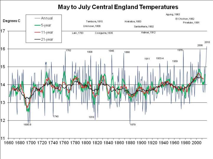
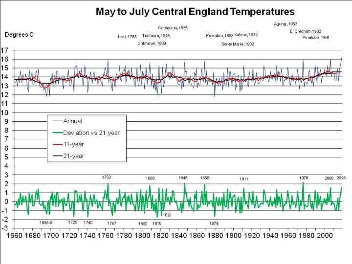
A further problem is that the IVI does not explain all of the data. For example, the cold period in the 1690s, including the exceptionally cold summer in 1695, as well as the record cold summer of 1725 (see my recent post on the cold summer of 2011) are completely unexplained. Note that the 1690s has long been a problem. Lamb interrupts his DVI list to discuss it (note the criticism of subjectivity which may affect the whole DVI – the eruption data may be deduced from the weather data rather than independent of it). Here’s a screen grab of part of the DVI which is accessible on Google Books:

Excerpt from Lamb, Climate: Past, Present and Future

More recently, I’d understood* that the dip in temperatures at the start of the 20th century was due to the Santa Maria eruption of 1902 (not to be confused with the famous Mount Pelee eruption of the same year, which is notable for causing a large number of fatalities). But there is only a small signal in the Gao et al data for 1902 (3.77 compared to 30.09 for 1991, the year of Pinatubo, limiting Gao et al’s spurious accuracy perhaps less than I should!).

* e.g. in the IPCC figure produced in a previous post.

2. Eruptions may affect only one hemisphere.
Tropical eruptions can have effects on both hemispheres, depending on (apart from the characteristics of the eruption and the weather at the time) latitude and time of year (and hence the position of the inter-tropical convergence zone, ITCZ). In their paper, Gao et al in fact separate out the hemispheric sulphate records:

Pinatubo affected both hemispheres, but El Chichon only the northern hemisphere (NH). El Chichon, though, seems to have reflected away at least as much heat, having produced a volcanic cloud “extending from the Equator to 30 deg N for more than 6 months, and then gradually spreading more widely” (Alan Robock, 2002, PDF). We can see this first in the atmospheric transmission of solar radiation record from Hawaii:

and, more to the point, in the record of oceanic heat content, where the dip in the early 1980s seems to have been greater than that in the early 1990s (though perhaps already underway by the time of the eruption):

So, if El Chichon removed more heat from the oceans than Pinatubo, and removed the bulk of it from the NH, you might expect some kind of effect on the Arctic ice. Here’s the annual ice extent for August 1979-2011, from the (US) National Snow and Ice Data Centre (NSIDC):

1983 and 1991 both seem to be above the annoying blue trend line (I always feel you need a better reason for drawing lines through data than that you feel like it!), but one might expect the effect to take longer than one year to play out. Indeed, if you imagine replacing the annoying blue line with one from around the turn of the millennium when one might suppose the effects of the two eruptions to have played out, the trend would seem to be a lot steeper. Maybe this tells us nothing more than that the eruptions cause a bit of an ice melt backlog, but I just thought I’d throw that point in.

Perhaps resolving the puzzle a tad, Realclimate have helpfully drawn my attention to ice volume data from PIOMAS, which I copy here purely for convenience:

This perhaps shows more clearly the greater effect of El Chichon (1982) than Pinatubo (1991) on the Arctic ice, though, again, we have trend-lines that confuse the issue, and, again, the eruption occurred somewhat after the temporary ice volume minimum at the start of 1982, and could not have influenced ice volume until at least mid-1982. Notwithstanding, if, here, one ignores the blue line and confidence-interval shading, one might postulate that the combined effect of the two eruptions was to negate any ice-melt that would have otherwise occurred – due to global warming and the fact that if the ice builds after eruptions, logic suggests that it must melt in their absence – for almost two decades, from 1982 to the turn of the millennium, and tentatively conclude that we’re now playing catch-up.

3. Tropical eruptions are climatologically more important.
The theory (Eruptions, p.72-3) seems to be that high latitude eruptions have less effect on climate, though time of year is obviously critical. Although Laki (1783) had dramatic effects on the climate, at least for a year or two, it was a very large eruption.

Oppenheimer briefly mentions the case of Kasatochi (August 2008), a moderate sized sulphur-releasing eruption in Alaska, and the most significant climatologically since Pinatubo (1991). Sure enough, you can see the signal in the Mauna Loa, Hawaii record, above (now I realise I should have numbered the figures). And here’s the possibility of an effect in another ice extent representation from NSIDC:

Not very conclusive**, but maybe the ice did start to re-form a bit quicker than usual in 2008.

** See also the Postscript to this post.

4. The climatic effects of eruptions last only for a few years.
There seems to be an emphasis in the literature on the short-term effects of eruptions. Presumably this is because an event, such as the eruption of Pinatubo, attracts a burst of interest – and generates a flurry of publications – for a few years, before everyone moves on to other projects. Oppenheimer (p.76), suggests forcing lasts around 3 years, after which aerosols disperse, temperature is affected for around 7 years, and sea-ice “perhaps for a decade”. But, he says, oceanic circulation “can be perturbed for up to a century”. Surely this in turn would affect climate? The emphasis on transient effects seems to conflict with the reconstructions of historic temperature records, when, I understood, the main explanation for century-scale variability (the Little Ice Age and all that) is the pattern of natural forcings, principally volcanic eruptions. The story doesn’t appear to be entirely straight, and perhaps this is due to an emphasis on debunking the idea that supervolcanoes (such as Toba 73kya) could have plunged the Earth “back into the ice age” (Oppenheimer, p.190ff).

5. The climatic effect of eruptions scales less than linearly – larger eruptions do not have a proportionately greater effect.
The theory (Oppenheimer, p.191-2) seems to be that larger eruptions produce so much sulphur that larger sulphuric acid particles form, which descend through the atmosphere quicker, so that larger eruptions (as indicated by the sulphuric acid loading in ice cores) do not have proportionately greater effects on the climate.

This all seems a bit speculative. I would have thought a sufficient explanation was that, assuming larger eruptions don’t affect the atmosphere for longer than less extreme events (you’d expect similar sized particles to descend at a similar rate however many of them there are), it seems impossible for effects to scale, given the amount of sunlight reflected away by even relatively small eruptions like Pinatubo and El Chichon (see the Mauna Loa diagram, above, again!). After all, there’s only so much sunlight to reflect away, so (as for greenhouse gases) the energy gain (negative in the case of volcanic aerosols) will be a log function of concentration.

6. The effect of eruptions is to produce cool summers and mild winters.
Except when they don’t.

This is a very confusing aspect, perhaps complicated by the small sample size of recent eruptions. There’s also a need to clarify what is meant.

It’s certainly true that it’s rare for the year of an eruption to experience a cold NH winter. This is what I naively expected when I first started looking at the Central England Temperature (CET) record – eruptions cool the planet, so winter should be colder, right? But in fact cold winters do not immediately follow eruptions, with one notable exception – 1784 after Laki, which also produced a hot summer (Oppenheimer devotes his chapter 12, The haze famine, p.269ff to this event, a repetition of which would, even, or maybe especially, in the 21st century, present serious challenges to health, transport – especially air – and agricultural services in Europe and maybe the entire Northern Hemisphere).

The general story seems to be that eruptions produce more zonal weather at least in the short-term, by heating the stratosphere and disrupting poleward heat transport by the large-scale atmospheric circulation. This leads to mild winters in western Europe (i.e. the zonal pattern of westerly airstreams dominates).

It seems to me there must also be an immediate effect on patterns of oceanic temperature and heat content. I’ve noted before that it appears volcanoes can trigger or exacerbate El Nino events, although this seems to be an area of controversy. Among other effects this may tend to produce mild NH winters.

But perhaps there are also persistent effects on patterns of oceanic heat content, thought to determine NH winter weather in particular. For example, there were generally mild winters in the UK at least for more than a decade after Pinatubo. Yet cold winters – and often runs of colder than usual winters – followed a few years after Huanyaputina (1600 – 1607 was extremely cold); the unknown 1809 eruption (General Winter defeated Napoleon in 1812 and 1814 was the last Thames Frost Fair); Katmai (1912 – 1917 was particularly cold); an eruption in 1925 which has a similar ice-core sulphur signature to Katmai (1929 was cold); Agung (1963); and El Chichon (1982). It’s a confusing picture, and it’s possible that these eruptions simply occurred during series of cold winters (e.g. the famously cold winter of 1962-3 was over by the time of the Agung eruption). Nevertheless, a hypothesis might be framed to relate the location (and season) of eruptions and hence their differential effect on ocean heat content in different regions (or just latitudes) to their effect on climate over a decade or more, through intensifying or weakening (or, in the case of the largest eruptions, completely overriding) the underlying multi-decadal cycles, such as the Atlantic Multi-decadal Oscillation (AMO).

Scientists often give the impression that they’ve answered all the questions. It’s often seemed to me that this puts off those most inclined to produce radical new ideas from specialising in the disciplines that seem to be “solved”. That is certainly not the case with the effect of volcanic eruptions on climate. There are more questions than answers. And, if the historic record is not enough, new events to investigate occur every few years. I’ll certainly be keeping an eye out for new developments in the field.

Postscript (2/10/11): Amended post to tidy up section on cold winters following eruptions, adding a reference to the 1809 event (location unknown) and to scale down some of the diagrams so they’re less in your face. Also, the figure below (from JAXA via Realclimate), perhaps shows the more than usually rapid ice build in 2008 more clearly than the NSIDC figure above, though you have top look closely at the spaghetti to see that the 2008 dark green line shows one of the lowest September ice extents in the period covered turning into one of the highest extents by November:
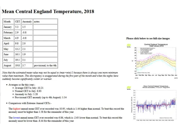
September 3, 2011

How unusual was the cool UK summer of 2011?

Filed under: Global climate trends, Global warming, Science, UK climate trends — Tim Joslin @ 7:05 pm

Why do so many in the media feel they have to get their story in before the final whistle? It’s always a risk. Towards the end of August, a number of articles, typified by this one in the Guardian, trumpeted 2011 as “the coldest summer since 1993”. Political correctness is the order of the day – judging from the figures quoted, the record refers to the whole of the UK. I prefer to use the Central England Temperature (CET) record, which goes back further, to 1659. And I waited until the final data was in (there’s always a delay at the end of the month before the Met Office provide the final figure) and updated my spreadsheet. Here’s my latest summer temperature graph:

CET for Summers 1660-2011 (smoothing shown at central point of date range)

Note that my running means (smoothing) are shown centred, i.e. for the central of the 5, 11 or 21 years averaged. I tried the possible alternatives (i.e. trailing and forward – the latter to try to see the effect of events, such as eruptions), but this representation seems clearest to me. This way, you can most easily see the effect of, for example, the mystery eruption of 1809 and the Tambora eruption of 1815, with all curves dipping at about the same time.

I was expecting to be writing that a comparison with 1993 is not a level playing field, since the eruption of Pinatubo in 1991 cooled the whole planet for a few years (see the graphs from James Hansen that I posted in 2010), making 2011 more freakish, since there hasn’t been a recent eruption. But, in the CET record at least, summer 2011 was in fact colder than 1993.

As the graph shows, there were some colder summers in the mid 1980s, but, again, the whole planet was cooled a tad at that time by the eruption of El Chichon in 1982.

So you have to go back to the 1970s to find a summer cooler than 2011 that wasn’t induced by a volcanic eruption.

Still, you can expect the coldest summer in 40 years every 40 years, so on this reckoning 2011 was not that exceptional – compared to, say, December 2010.

But let’s go a little bit further and take global warming into account. Because of global warming we’d expect warmer summers. Indeed, as the graph shows, prior to 1933, the CET summer mean had only exceeded 17C twice (in 1826 and 1846). The mean CET touched 17C in 1933 and edged past it in 1947. But in the last 40 years it has passed that mark on 5 occasions: 1976, 1983, 1995, 2003 and 2006. The 5, 11 and 21 year running means have all broken new ground.

We should really judge the freakishness of 2011 against the prevailing summer temperature. The trouble is, we don’t know whether temperatures will continue to increase, level off for a decade or two, or even dip – that’s why the 11 and 21 year running mean curves stop before they get to the present day. If summers over the next few years are as warm as from 2003-6, then 2011 will look very unusual – perhaps the most atypical summer since 1860, which was more than 1.5C cooler than might have been expected.

On the other hand, if it turns out that the atypical summers were 2003-6, and temperatures level off for a while, then summer 2011 will just represent the sort of anomaly that might be expected every few decades, rather than a once a century or two event.

Regardless, 2011 is a long way from matching 1725 as the most disappointing summer in the CET record. 1725 was even cooler than 1816, the “year without a summer” following the Tambora eruption!

So, 2011 was surprisingly cool, but not unprecedented.

———
Incidentally, anyone who followed the link to my previous post which looked at global temperature data might have noticed that the graph of the mean summer UK CET record is uncannily similar in shape to that of (annual, not just summer) Northern Hemisphere (NH) temperatures as a whole.

For more convenient comparison here’s a more recent graph (i.e. including 2010) from the GISS graph site (we’re primarily interested in the solid red line representing the 5 year running mean NH temperature):

The hemispheric temperature record from GISS

Note how, in both graphs, the temperature peaks around 1900, then dips (usually attributed to the 1902 Santa Maria eruption), rises from around 1920 to a peak around 1940, dips again to 1970 or so, then rises into the new millennium. Overall, the magnitude of UK summer temperature changes is about the same as that for the NH as a whole, though the 1930s to 1940s peak is a little more pronounced. So it’s not just UK summer temperatures that vary – as I said, in comparing summer temperatures for freakishness (rather than trends), we need to take account of global warming.

Note also the effects of the eruptions of Pinatubo (1991) and El Chichon (1982) on the NH temperature record (or at least the dips in NH temperature following the dates of the eruptions!). This justifies my decision to exclude 1993 and the mid 1980s summers from the comparison with 2011.

I recently visited my storage unit and discovered that some boxes had fallen and damaged a fan I bought in response to the heat in, I think, 2005. The fan had been gathering dust for a few years – I haven’t needed it. The fact that I’ve paid to store the thing surely shows, though, that I certainly didn’t expect such a change from 2003-6, when all summers exceeded a mean CET of 16C, to 2007-11 when none have (the sudden dip in summer temperatures is clearly shown by the green 5 year running mean in the first figure, above). This weather/climate business is sure full of surprises!

January 18, 2010

Musings of the Hemispheres

Filed under: Global climate trends, Global warming, Science — Tim Joslin @ 12:58 pm

I should really try to finish one blog post before I start another on a similar topic. My last (published) post noted that the North Atlantic Oscillation (NAO), an atmospheric phenomenon, is not a climate driver, rather it’s a measure of the state of the climate – incidentally, I’m pleased to discover this morning that Philip Eden at Weatheronline.co.uk holds similar views. In a post that may or may not ever appear, I was going to note similar thoughts about the so-called Atlantic Multidecadal Oscillation or AMO.

It’s not my understanding of the oceanic circulation that great surges of current drive the climate. Rather the oceanic circulation is itself driven by changes in heat distribution at the surface. OK, there may be timelags and of course there’s the El Nino, but that’s about it. If the El Nino is driven by ocean currents (which I believe it is), these are, crucially, east-west, not north-south. The planet loses heat partly because heat moves (in water and air) from the tropics towards the poles where it is more easily radiated away (or used to melt ice). I suggest, therefore, that changes in oceanic circulation are primarily caused by changes in the absorption of heat at the surface. For example, if the planet is warming, you’d expect a general strengthening of oceanic circulation.

What’s piqued my renewed interest in this topic is James Hansen’s release of temperature data for 2009, available over at Realclimate. In particular, Hansen includes separate temperature graphs for the southern and northern hemispheres. I reproduce these here for convenience (the diagrams in my previous post were from Wikipedia, btw):

Fig 1: Annual temperatures

Fig 2: Running mean temperatures

Looking at the right hand graphs, comparing temperature changes in the hemispheres, we see that sometimes the northern hemisphere warms quicker than the southern hemisphere, whereas at other times the reverse is true. What would we expect, though? Well, there’s a lot more water in the southern hemisphere and a lot less land. We’d therefore expect the south to warm (and cool) slower than than the north (and, in the long-term, catch up when temperatures stabilise at a different level). And, indeed, this is what appears to happen most of the time: since the mid 1970s, the northern hemisphere has warmed much faster than the south; on the other hand, the cooling (clearest in Fig 1) caused by the Mt Pinatubo eruption in 1991 was most evident in the northern hemisphere.

But – there’s always a “but” – for significant periods of time (I consider the weather can affect annual data, but not decadal trends) – for example, from around 1950 to the mid 1970s – the southern hemisphere has actually warmed when the northern hemisphere has cooled. This requires explanation.

There are only two possibilities: either the one I’ve already dismissed, that large amounts of heat are, by some unexplained causal mechanism, transferred between the hemispheres, or, that there are factors causing the hemispheres to gain different amounts of heat at different times. Specifically, for several decades from around 1950, the southern hemisphere must have either gained heat, whilst the northern hemisphere lost it, or, more probably, two countervailing factors were involved: one causing a general warming and the other cooling, but disproportionately of the northern hemisphere.

We know that increased levels of greenhouse gases are tending to warm the planet. The inescapable conclusion is that another factor tends to cool the northern hemisphere more than the southern hemisphere. The argument that from the 1940s through to the 1970s this was “global dimming“, caused by sulphur dioxide and other pollution is highly persuasive. Most of this pollution is emitted in the northern hemisphere and doesn’t stay in the atmosphere long enough to spread evenly.

What’s happening now, though?

Well, what strikes me in Hansen’s graphs is the levelling off of warming over the last few years. There’s not yet really enough data to reach any sort of conclusion, but Hansen notes 2009 was the second warmest year on record. In fact, though, his data (Fig 1), suggest it was the warmest year in the southern hemisphere and around the 7th warmest in the north.

Given the rapid industrial development of China and India, it seems justifiable to hold a working hypothesis that we face renewed global dimming.

You would expect a layer (or layers) of reflective particles in the atmosphere to reflect a greater proportion of light from the sun in the winter than in the summer, so another way to test the hypothesis would be to examine seasonal rates of warming over the past century or so. The trouble is, seasonal temperatures are very much affected by poleward heat transport and weather patterns themselves dependent on whether the planet (or hemisphere) is warming or cooling, but nevertheless I’d expect average temperatures in continental interiors (with stable seasonal weather patterns and especially anticyclonic conditions in both winter and summer) at high latitudes to fall more in winter than in summer during periods when global dimming increases, i.e. when the rate of warming of the planet as a whole slows down.

Of course, we could also put a bit more effort into simply measuring the strength of sunlight at the top of the atmosphere (to account for variations in solar output) and at ground level in cloudless conditions (or controlling for cloud cover).

If the analysis that the climate is being affected by renewed global dimming is correct, it’s really bad news. What it implies is that, when the presently industrialising nations reduce their sulphur emissions (and assuming other countries don’t repeat the exercise), we could be in for another period of rapid warming (several tenths of a degree C per decade on average in the northern hemisphere), similar to that over the last quarter of the 20th century.

14/6/10: Minor correction, AMO stands for Atlantic Multidecadal Oscillation, not “Meridional”.

Create a free website or blog at WordPress.com.