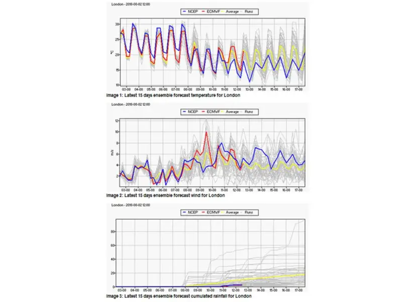
I suggested last time that 2018 could beat 1976 to the title of UK’s hottest summer ever in the whole Central England Temperature (CET) series which goes back to 1659. I now doubt that will happen since a change in the weather is on its way. Here are Weathercast’s projections, albeit a couple of days out of date as their site isn’t updating at the moment (I guess someone will be in the office on Monday morning!):
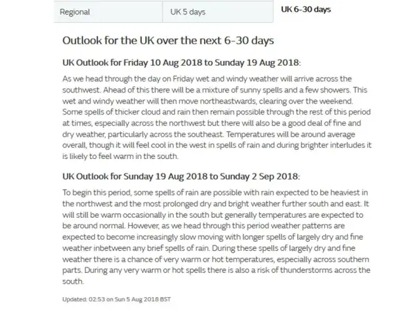
And here’s what the Met Office have to say:
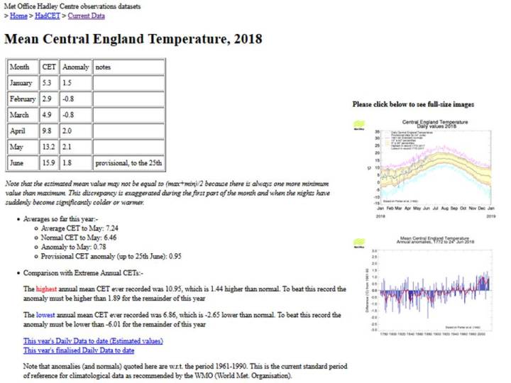
The CET mean for August so far is impressive:
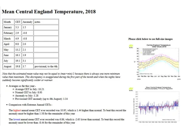 but a period of average daily mean temperatures (around 16C) will soon drag the monthly mean down below the 18C necessary for the June through August average to be higher than in 1976. Note that, after a cool start, it is now very possible that 2018 as a whole will be hotter than the previous hottest year in the entire CET record, 2014.
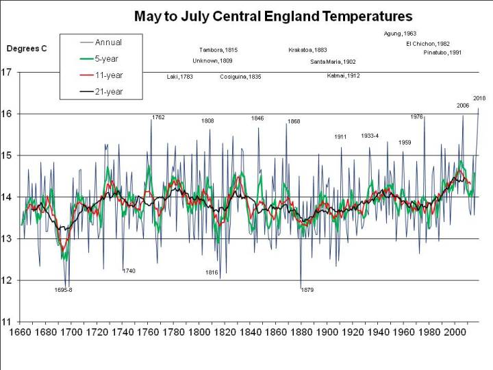
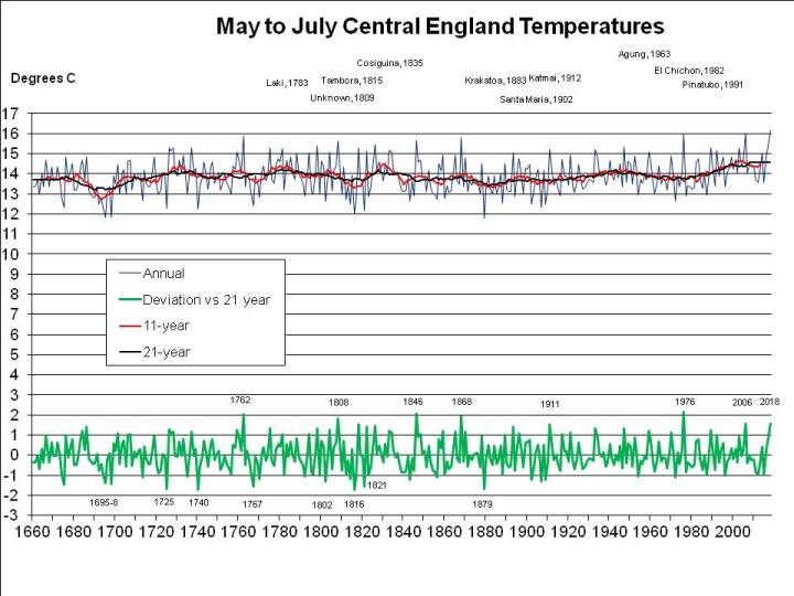
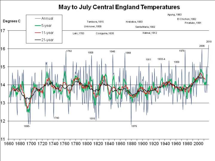
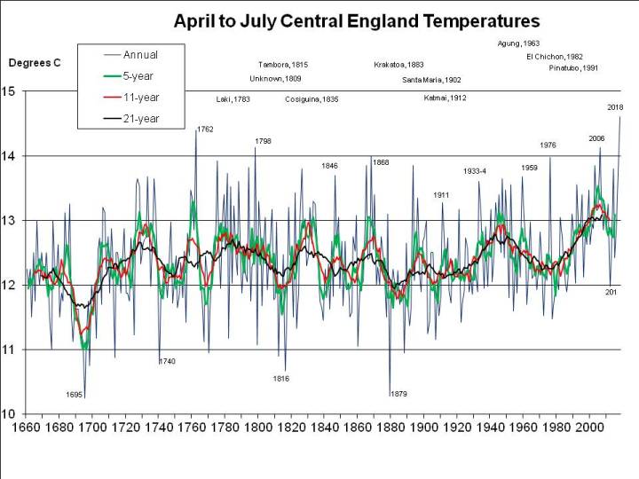
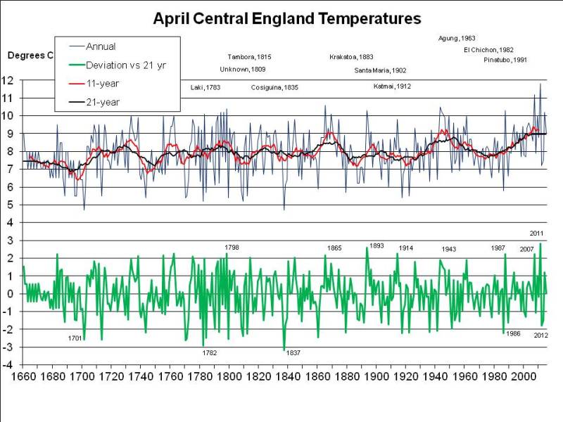
2018 has been exceptional, though. The problem is the arbitrary period (June, July and August) defined as the meteorological summer. But for 2018 to break all-time records it’s not even necessary to split months (e.g. by taking a period ending on 7th August). As I pointed out a fortnight ago, 2018 has been easily the hottest “early summer” – May, June and July – as well as easily the hottest for the period April through July. This seems very significant to me, because it illustrates the effect of global warming so starkly, but has been ignored or unnoticed by other commentators, so here again is a graph of mean annual May through July CET (as previously published, but with the final July figure of 19.1C incorporated):
The question is, how much worse could UK heatwaves get, with global warming?
Now, I find statements such as the following from a recent Guardian front-page lead to be extremely unsatisfactory:
“Events worse than the current heatwave are likely to strike every other year by the 2040s, scientists predict.”
Curiously, this sentence does not appear in the online version of the same article.
How can it be possible for summers as hot as 2018’s to occur every other year in less than 30 years?
The planet is warming at “only” somewhere around 0.2C per decade, so by “the 2040s” is unlikely to warm by more than 0.6C. And my patent graph above shows that May through July 2018 has been around 1.5C warmer than the same period has been on average in recent years (and more than 2C warmer than it used to be in the average year).
So it would seem that, even by the 2040s, another summer as hot as 2018 would be quite unusual if average summer temperatures are only 0.6C warmer than at present: the graph above shows few summers – less than 10% – 1C or more warmer than the 21-year running mean (the black line).
It seems the “heatwave every other year” statement refers to temperatures across Europe as a whole. This is problematic for two reasons.
First, as the European Environment Agency reports, land temperatures are rising nearly twice as fast as ocean temperatures:
“According to different observational records of global average annual near-surface (land and ocean) temperature, the last decade (2008–2017) was 0.89 °C to 0.93 °C warmer than the pre-industrial average, which makes it the warmest decade on record.
The average annual temperature for the European land area for the last decade (2008–2017) was between 1.6 °C and 1.7 °C above the pre-industrial level, which makes it the warmest decade on record.”
Second, the “every other year” claim may be based on the average for a large area. As pointed out by King and Karolyi in Nature (“Climate extremes in Europe at 1.5 and 2 degrees of warming” (pdf)):
“The highest changes in frequency are projected for the largest regions as the year-to-year variability is lower on these spatial scales…”
The UK is some islands next to Europe sticking out into the Atlantic at a latitude where weather systems usually move from west to east. Its climate is therefore influenced more by the ocean than the nearby continental landmass. Thus average UK summer temperatures have not been and will not by the 2040s rise as fast as for the land area of Europe as a whole.
The statement in the Guardian should not be taken as applicable to the UK.
Nevertheless, as summer 2018 shows, there are times when the UK is in step with Europe, climate-wise. And that’s when we get those exceptionally hot days and even entire summers.
The simple way to look at the risk of something worse than 2018 is to consider by how much freak UK summers in the past have been warmer than the average contemporaneous summer.
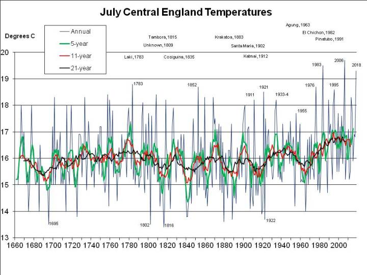
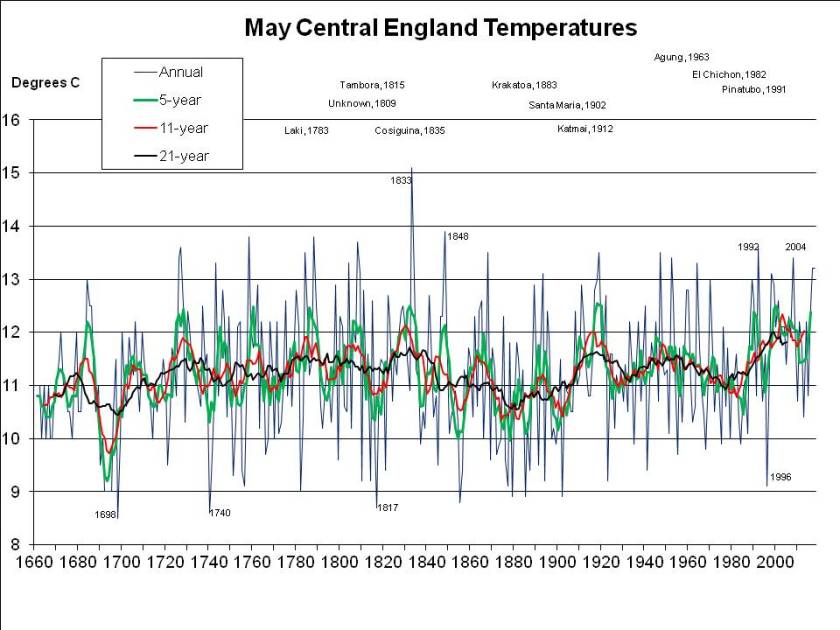
Let’s consider July and August first, since that’s when the heat is most intense. The following chart shows mean summer temperatures since 1659 at the top, with 11- (red) and 21-year (black) running means. At the bottom, in green, it shows the deviation of each year from the 21-year running mean centred on that date (extrapolated at the ends of the graph, by assuming no change from the first or last available year):
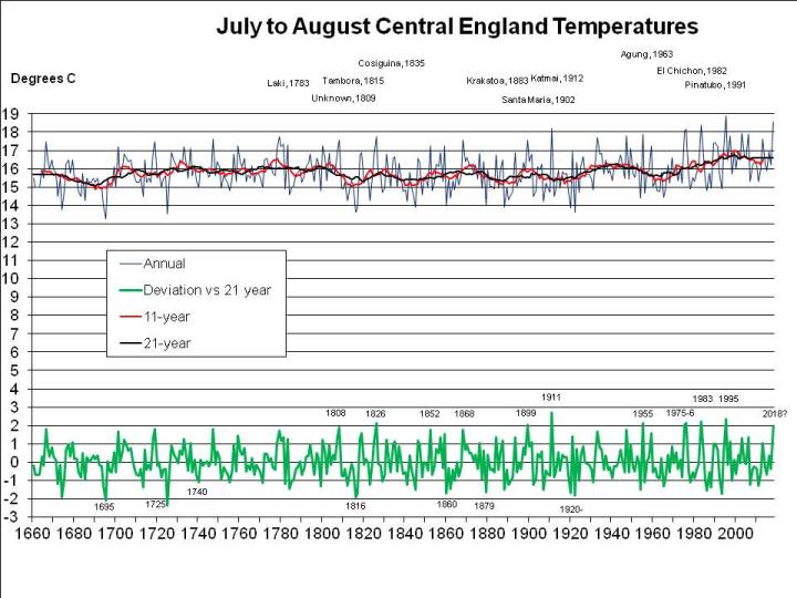
The most exceptional year in the entire 350 year series is 1911, when, as I mentioned in a previous post, the nobility reportedly played tennis in the altogether at their country estates, while riots broke out in the cities. The mean temperature in the CET series for July and August 1911 was 2.73C above the mean for 1901-1921.
If 2018 were to average 18C, as I previously assumed rather bullishly, it would only be 1.97C warmer than the mean nowadays (and maybe even less, since I’ve used the mean for 1998-2018 and not for 2008-2028, which won’t be available for another decade, but may well be higher). For 2018 to be as freakishly hot as 1911, the mean CET for August would have to be 19.6C, that is rather hotter than in the hottest August recorded (1995, at 19.2C), but following the third hottest July on record, at 19.1C. When there’s already a media frenzy about the heat in July, we’d have to experience an even hotter month – moreorless the current uncomfortable weather continuing for nearly another 4 weeks, rather than breaking up in a few days. Not a pleasant prospect, but apparently possible, on the evidence of 1911.
And I mentioned earlier that May to July 2018 has been the hottest on record. But was it the hottest it could have been? It seems not. Other years were much more exceptional for their period, the record being 1976, which, relative to summers of the time, was more than 0.6C warmer from May to July than 2018:
So one real risk for the UK is that we could experience a truly freak summer, that is, a summer much hotter than the warmer summers we are experiencing because of global warming. 2018 has been exceptionally hot on some measures, but much of that has been due to global warming. It really hasn’t been a freak.
But has global warming changed what’s possible? Could there be even more serious heatwave risks for the UK than summer temperatures as much above the current norm as they were in 1911 and 1976? These questions will be addressed in the next exciting instalment!


“No, no, no!!”, I was obliged to point out, adding, by way of explanation that:
Good grief.
After that I was hardly surprised – since your average journo seems not even to be an average Joe, but, to be blunt, an innumerate plagiarist – to read in the Evening Standard on the 13th itself:
See what they’ve done there? With a bit of help from Mr Google, of course.
In the event, it reached 34.4C on 13th, making it the hottest September day for 105 years.
Much was also made of the fact that we had 3 days in a row last week when the temperature broke 30C for the first time in September in 87 years.
But the significance of the 34.4C last Tuesday was understated.
The important record was that the temperature last Tuesday was the highest ever recorded so late in the year, since the only higher temperatures – 34.6C on 8th September 1911 (the year of the “Perfect Summer”, with the word “Perfect” used as in “Perfect Storm”) and 35.0C on 1st rising to 35.6C on 2nd during the Great Heatwave of 1906 – all occurred earlier in the month. By the way, in 1906 it also reached 34.2C on 3rd September. That’s 3 days in a row over 34C. Take that 2016. They recorded 34.9C on 31st August 1906 to boot, as they might well have put it back then.
No, what’s really significant this year is that we now know it’s possible for the temperature to reach 34.4C as late as 13th September which we didn’t know before.
I’m going to call this a “date record”, for want of a better term. Any date record suggests either a once in 140 years freak event (since daily temperature records go back that far, according to my trusty copy of The Wrong Kind of Snow) or that it’s getting warmer.
One way to demonstrate global warming statistically is to analyse the distribution of record daily temperatures, i.e. the hottest 1st Jan, 2nd Jan and so on. Now, if the climate has remained stable, you’d expect these daily records to be evenly distributed over time, a similar number each decade, for example, since 1875 when the records were first properly kept. But if the climate is warming you’d expect more such records in recent decades. I haven’t carried out the exercise, but I’d be surprised if we haven’t had more daily records per decade since 1990, say, than in the previous 115 years.
It occurs to me that another, perhaps quicker, way to carry out a similar exercise would be to look at the date records. You’d score these based on how many days they apply for. For example, the 34.4C on 13th September 2016 is also higher than the record daily temperatures for 12th, 11th, 10th and 9th September, back to that 34.6C on 8th September 1911. So 13th September 2016 “scores” 5 days.
Here’s a list of date records starting with the highest temperature ever recorded in the UK:
38.1C – 10th August 2003 – counts for 1 day, since, in the absence of any evidence to the contrary, we have to assume 10th August is the day when it “should” be hottest
36.1C – 19th August 1932 – 9 days
35.6C – 2nd September 1906 – 14 days
34.6C – 8th September 1911 – 6 days
34.4C – 13th September 2016 – 5 days
31.9C – 17th September 1898 – 4 days
31.7C – 19th September 1926 – 2 days
30.6C – 25th September 1895 – 6 days
30.6C – 27th September 1895 – 2 days
29.9C – 1st October 2011 – 4 days
29.3C – 2nd October 2011 – 1 day
28.9C – 5th October 1921 – 3 days
28.9C – 6th October 1921 – 1 day
27.8C – 9th October 1921 – 3 days
25.9C – 18th October 1997 – 9 days
And you could also compile a list of date records going back from 10th August, i.e. the earliest in the year given temperatures have been reached.
The list above covers a late summer/early autumn sample of just 70 days, but you can see already that the current decade accounts for 10 of those days, that is, around 14%, during 5% of the years. The 2000s equal and the 1990s exceed expectations in this very unscientific exercise.
Obviously I need to analyse the whole year to draw firmer conclusions. Maybe I’ll do that and report back, next time a heatwave grabs my attention.
It’s also interesting to note that the “freakiest” day in the series was 2nd September 1906, with a daily record temperature hotter than for any of the previous 13 days. 2nd freakiest was 19th August 1932 – suggesting (together with 2nd September 1906) that perhaps the real story is an absence of late August heatwaves in the global warming era – joint with 18th October 1997, a hot day perhaps made more extreme by climate change.
Am I just playing with numbers? Or is there a serious reason for this exercise?
You bet there is.
I strongly suspect that there’s now the potential for a sustained UK summer heatwave with many days in the high 30Cs. A “Perfect Summer” turbocharged by global warming could be seriously problematic. I breathe a sigh of relief every year we dodge the bullet.